The Psychology of Color in Fine Art
“Gondola and Harlequin” serigraph by Virginia Ferrara
When artists paint or create, they typically focus on the subject and message rather than merely the color. Yet the psychology of color in fine art—that is, the effect of color on the viewer—is evident. When choosing fine art for your home or commercial space, one can consider color a key element in your arrangement. Zimmerman Fine Art in Baltimore, MD, has high-quality, colorful fine art that can meet your color needs.
Red
Red is a color of passion, love, and affection, but it is also a color used to express boldness and aggression. Red is the ultimate pop of color. If you want to decorate your home with art that emits warmth and affection try using red and a few complementary colors. If you are decorating a commercial space, you might use red to fuel ambition, courage and action.
Orange
Like the other warm colors, the many shades of orange from rust to cinnamon to pumpkin and orange blossom, can be a statement color that evokes warmth, courage and vibrancy. It is much a universally loved, warm, and comforting color and gives off the joy of fall, fire, sunrise and sunset.
Yellow
It is harder to find a happier color than yellow. Yellow is often a color that adds a sense of delight and joy to an art piece. Paired with red, it can make people feel hungrier than they might actually be, which is why so many fast food logos have adopted this combination. Yellow is evocative of sunshine, summer, warmth and fun.
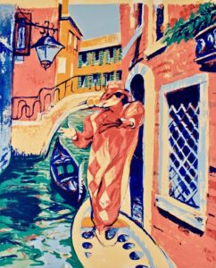
“Gondola and Harlequin” serigraph by Virginia Ferrara
Green
Green is the color of nature, and therefore a color that relaxes. Unlike other colors, it not only brings a sense of serenity, but it also encourages one to think of rejuvenation and health. Green is the color of gardens, trees, grass, and life.
Blue
Blue is a heavenly color that can express a wide range of emotions. It can invigorate, it can calm, and it evokes beautiful skies, rivers, and oceans, and clear weather. When choosing colors that will express a business brand, blue is the color that most communicates trustworthiness. In the home, it can add serenity and a sense of well being.
Purple
Purple expresses a sentiment of fantasy, creativity, or nobility. Purple can be fun, fanciful, entertaining, but lavender hues tend to invite relaxation and serenity. If you want to impress guests or visitors, purple adds a touch of luxury.
Neutrals
Black is the absence of light, and white is the combination of all colors of light. Neutral tones, like grays and beiges, keep the atmosphere calm. These neutral colors allow the bright colors to pop, providing the perfect balance and contrast.
Contact Zimmerman Fine Art Today!
Since 1979 Zimmerman Editions Ltd. has worked closely with many internationally acclaimed artists to execute editions of their most unique images. Collaborating directly with the artists, Zimmerman Editions’ atelier has printed, fabricated, and published many special limited editions of fine art, including both prints and sculptures. All images have been faithfully produced to meet the artists’ most exacting requirements. Many of these high-quality art prints and objets d’art are represented in public and private collections around the world.
If you are a fine art dealer or marketer, or interested in collecting contemporary fine art, contact us today through our short form or our number at 888-484-1850. For more about fine art, keep in touch through Facebook, Twitter, and LinkedIn!